|
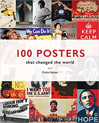
100
POSTERS THAT CHANGED THE WORLD
By Colin Salter
Pavilion Books. 224 pages. £14.99. ISBN 978-1-911641-45-2
Reviewed by Jim Burns
Posters are always all around us. When I’m out and about these days
they’re telling me to wear a face mask, wash my hands regularly, and
stay a safe distance from other people. If I look back seventy-five
years I can recall posters that told people to “Dig for Victory”
(the image of a booted foot pressing down on a spade has stayed in
my mind) and warning them that “careless talk costs lives”. Posters
such as these signify just one use of them- to keep us alert to
possible dangers – but there have been plenty of other posters,
providing information, entertainment, propaganda, that have adorned
walls, windows, and a variety of places where passers-by might see
them. That’s the idea of a poster – to catch your eye and tell you
something. Colin Salter refers to the Russian poet Mayakovsky, who
said, “that if a poster could not bring a running man to a halt it
had not done its job”.
In its simplest form a poster may just contain text. Salter
reproduces a proclamation that was issued by Parliament for the
apprehension of “Charls Stuart” (the future Charles the Second)
following the Royalist defeat at Worcester in 1651. It’s plain and
straightforward in its presentation, and if displayed in a public
place would presumably have been read aloud for the benefit of those
who were unable to read. By contrast, a 1930s poster advertising
rewards for information leading to the capture of the notorious
gangster John Dillinger, had not only photos of him but also the
sums of money involved highlighted in larger lettering. The aim of
both posters was the same, to lead to an arrest, but technology had
made it possible to change ways of attracting the attention of
likely informants.
It was technology, primarily the development of lithography and the
use of colour, that led to the explosion of poster displays in the
late-nineteenth century. The posters that Toulouse-Lautrec created
to publicise The Moulin Rouge and its performers have shaped our
ideas of 1890s Paris to the point where it’s almost impossible to
think of that era without one of his posters in mind. But he wasn’t
the only artist producing posters to celebrate the clubs and
cabarets of Montmartre. Théophile Alexandre Steinlen’s poster
advertising Le Chat Noir, with its defiant-looking black cat staring
at the viewer, and what appears to be a halo of sorts around its
head perhaps mocking the work of Alphonse Mucha, seems to me
important in terms of typifying a specific period in Paris. It might
also be appropriate to mention Jules Chéret. He was one of the most
prolific poster artists of his time
and the pretty girls he portrayed became known as Cherettes and
achieved great popularity among Parisians.
Posters were not only known for their links to Montmartre and its
night-time entertainments. The late-nineteenth century saw the rise
of a middle-class with money to spend on more than the basic
requirements of life. Advertising, as it always is, was directed
towards those with the funds and the time to frequent cafés and
other leisure centres. Posters advocating the pleasures of alcohol
of one kind or another could be seen in the streets. Salter has one
for absinthe which is quite provocative in its way. It shows a
couple seated at a table with the well-dressed man watching a young
woman tentatively sipping at a glass of the green liquid. Is there
something in his look that suggests seduction? Salter at one point
talks about “persuasion by association” and it could be that was
what was in the mind of the artist. Persuade a woman to drink
absinthe and she’s yours? Suggestion can be a key factor in
advertising. Were the 1940s/1950s advertisements for Chesterfield
cigarettes only drawing attention to the product when they used
phrases such as, “Like your pleasures BIG?” and “Man-Size
Satisfaction”?
Good-looking females were and still are a standard item in
advertising. Males, too, though the emphasis has mostly been on
women. I’ve mentioned Chéret’s pretty girls and their roles in
pushing various products and much later PETA (People for the Ethical
Treatment of Animals) put a nude model on a poster protesting
against the use of fur. Not everyone was happy about it. They felt,
not without reason, that there was a doubtful aspect to illustrating
a message with a picture of a naked woman. And wasn’t it likely to
pull attention away from the message and focus it on her body? I was
intrigued by what Salter describes as “the biggest-selling poster of
all time, shifting 20 million copies”. It’s of Farrah Fawcett in a
red swimsuit, and according to Salter “adorned the bedroom walls of
many adolescent boys”. It’s quite innocuous, especially by today’s
standards, though might have been thought daring when I was a
teenager.
The fact that it “shifted 20 million copies” points to how posters
became items manufactured for sale and decoration rather than for
use in advertising. Almost from the start they had been sought after
by collectors, and it didn’t take long for galleries to mount
exhibitions of posters, and for shops that sold them to open. In the
early days it’s said that posters would often be removed almost as
soon as they’d been pasted up on walls and hoardings. The thieves,
if that’s what they were, had an eye to the artistic qualities of
posters by Toulouse-Lautrec, Chéret, Steinlen, and others. Or
perhaps realised that they would increase in monetary value as the
years passed.
There was often a serious purpose behind the production of posters.
They weren’t all designed to sell silk stockings, bicycles, beer,
and biscuits. Political posters came in a variety of forms, ranging
from encouragement to vote in a certain way to emphasising the solid
virtues of a leader. The cult of personality that surrounded Stalin
was accented in numerous examples of the stern but just leader, the
friendly leader, and the wise leader. Salter uses one or two good
ones to illustrate his comments. One shows Stalin holding a small
child waving a flag. His look is benevolent. I recall a few years
ago seeing an exhibition of Soviet social-realist art at the Russian
Museum in Málaga, and it struck me that Stalin seemed to be in just
about every other painting. He was seen addressing workers on
collective farms, chairing meetIngs of the Politburo, and poring
over documents. None of the representations of the Great Leader
naturally gave an indication of his lust for power and his
cruelty. As with an advertising executive constructing an
image for a politician only the positive could be emphasised.
With political posters it is always possible to draw attention to
negative matters. Salter uses the famous (perhaps infamous,
depending on your political leanings) Conservative Party poster,
“Labour isn’t Working”, which showed what appeared to be a queue
trailing back into the distance while the head of the
queue enters the Unemployment Office, or the Dole as I would
have known it. It was, like it or not, a striking and effective
image and may have been at least partly responsible for the Tories
winning the 1979 General Election. Salter has some interesting
things to say about how Saatchi & Saatchi created this poster. If
questions can be asked about some of his choices of posters and
their supposed impacts, there’s no doubt that this one did
contribute towards change.
War being politics by other means, posters plainly come into their
own when it’s necessary to persuade people to join up, work harder,
make sacrifices, and generally fall in behind whichever government
wants their support. There are famous posters which seem to
represent the mood of the moment, such as that of Kitchener pointing
his finger towards whoever is looking at the poster and demanding
that he should “Join Your Country’s Army”. It appeared in 1915 as
the need for men became increasingly obvious. From the Second World
War, and more to do with the home front in the United States, there
was the well-known “Rosie the Riveter” poster which celebrated the
role that women had to play by replacing men in the factories
turning out tanks, planes, and other armaments.
Motivating the civilian population was a concern in wartime, and in
1915 worries extended to the effect that alcohol consumption was
having on factory workers, miners, and many others. Lloyd George
proclaimed on a poster that “We are fighting Germany, Austria and
Drink…..and the Greatest of these three Deadly Foes is Drink”. It
was during the First World War that the licensing laws we lived with
for so long were brought into effect. At the time of the Second
World War there were poster campaigns to warn servicemen of the
dangers of sexual diseases: “You can’t beat the Axis if you get VD”.
The wars, First and Second, did allow may women to lead independent
lives, though the post-war situations often found that independence
under attack. It wasn’t just a case of men not liking the idea of
women doing jobs that had traditionally belonged to them. Their
new-found confidence made men feel uneasy. But any attempts by women
to move out of their “proper” roles had long been frowned on, as the
Suffragettes discovered when they agitated for the vote. Salter
presents posters from both sides of the story, with one
demonstrating what happens when working-class women get mixed up
with suffragette concerns and as a result neglect their homes and
children. Of the pro-suffragette statements I like an American
example where Rose O’Neill employed her Kewpie characters from the
strip cartoons she did for
The Ladies Home Companion and other publications for a poster on
which they ask that their mothers be given the vote: “Isn’t it a
funny thing/That father cannot see/Why mother ought to have a
vote/On how these things should be?” The “things” were food, health,
schools and other matters affecting children. The Kewpies were cute
and popular and would have caught the attention of the general
public.
Salter’s survey doesn’t only look at posters from the past, and in
fact his book has one from a 2019 Extinction Rebellion campaign. It
could, perhaps, be argued that the period from 1960 on has been a
golden one for poster designers and printers. The 1960s had a
resurgence of Art Nouveau which tied in easily with the psychedelic
layouts favoured by the so-called “underground” with its hippy
devotees. Posters advertised Woodstock and rock music. Out of the
same era came posters opposing the Vietnam War and stirring up
events in Paris. Film posters explored new angles, exploiting sex
and shock tactics to make people stop and, hopefully, think they
might like to see the film concerned. Salter uses a poster
advertising Jaws, with
the shark’s teeth prominently displayed.
It’s always been debatable if poster art, which is essentially
commercial art, can, at its best, be moved into a fine art category.
There are all kinds of interesting questions raised in this
connection. If I see a poster advertising an exhibition of a famous
artist’s work, and on which there is one of his paintings, has that
work been reduced in status by its use for a commercial purpose? I
doubt that any of us would think so. And we now happily accept
Toulouse-Lautrec’s work as art, even if it was done for the purpose
of advertising. I have to say that I’ve seen posters, many of them
skilled in their drawing and painting techniques, which seem to me
to be more interesting than a lot of the routine portrait and
landscapes found in galleries. Remove the brand name or slogan from
a poster and it could be viewed as a work of art and not just an
advertisement.
Colin Salter has put together an entertaining and informative book.
It covers much more ground than I’ve been able to indicate in this
review. Liberally illustrated, and with useful accompanying text, it
provides a good guide to the qualities and uses of posters.
|